
Crafting a Student-Oriented and Scalable OnePratt Design System

ROLE
Product Designer
TEAM
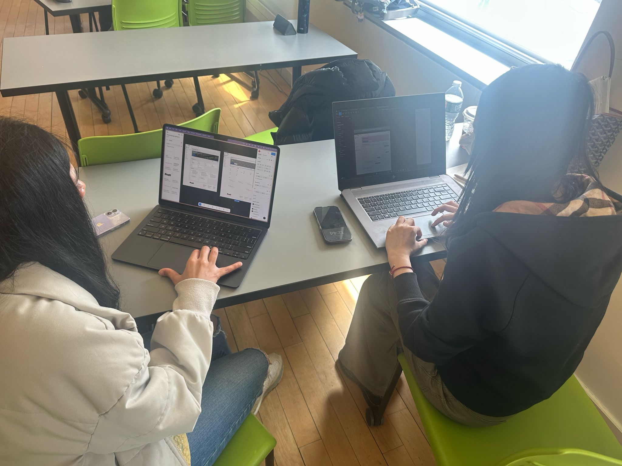
3 UX/UI designers
Timeline
2025 - 12 Weeks
SKILLS
Design Systems, UI Design
Tools
Figma, Zeroheight
CONTEXT
Redesign onePratt and Built a Comprehensive Design Systems From Scratch
onePratt is a centralized platform that gives students streamlined access to essential academic tools and services. However, a lack of a formalized design system led to inconsistent UI and poor user experience. Our design team took on the challenge to redesign onePratt and built a comprehensive design system from scratch aimed at enhancing student engagement, improving accessibility, and making it easier for future developers and designers to collaborate and maintain the platform.
Problem
A Resource Platform Students Couldn’t Use Confidently
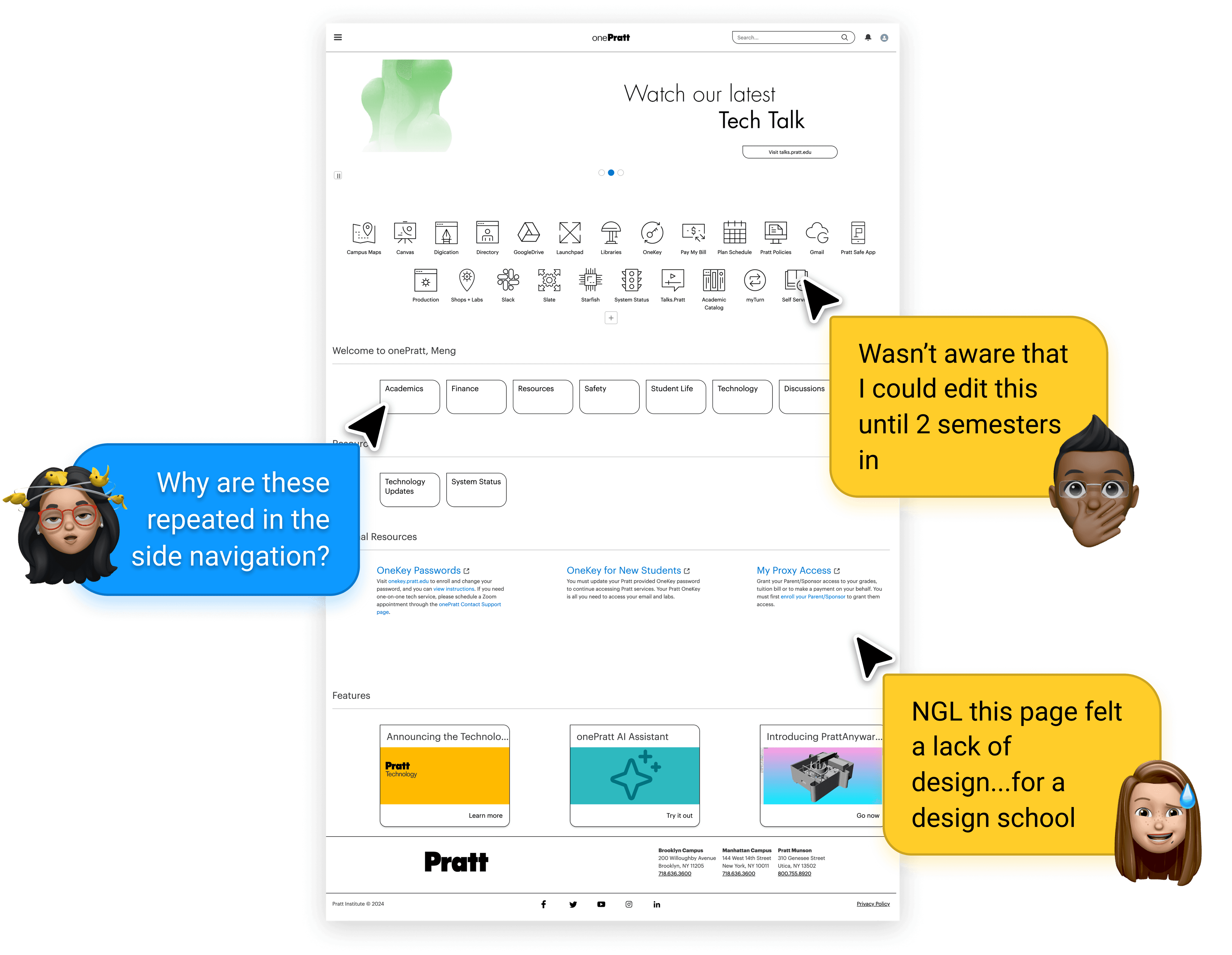
As Pratt students, we’ve all experienced the frustration of using the onePratt platform. Navigation felt clunky, components were inconsistent, and the interface lacked clarity. When we spoke to our peers, it became clear: we weren’t alone.
The issues weren’t just surface-level. Beneath the UI, the platform lacked a cohesive design system — and the IT department, made up only of developers, had no unified visual or interaction language to build from. There were no dedicated designers, and no shared documentation or toolkit.

How might we create a student-centered design system that improves the OnePratt experience while equipping future designers and developers to build consistently, efficiently, and accessibly?
DESIGN PROCESS

Design systems audit
Breaking down One Pratt's Current UI
We began with a thorough UI audit of the onePratt platform, breaking the system down into atomic elements such as color, typography, buttons, links, layouts, and cards and identifying major usability and accessibility gaps.
Key Problems We Found:
Typography and Visual Inconsistency
6 heading styles, mismatched text hierarchy, and poor readability
3+ button styles with inconsistent hover states and unclear use cases
Interaction Confusion
Multiple card types and link formats used for similar content
Navigation patterns varied across pages, leading to user disorientation
Accessibility Failures
Color contrast issues
Missing accessible patterns and no adherence to WCAG standards
These inconsistencies added up to a fractured experience: students feel less confident using the platform, and developers lacked a structured way to improve it.
DESIGN DIRECTIONS
After listening to students’ frustrations and conducting a thorough UI audit, our team uncovered critical issues that weren’t just minor design flaws; they were barriers to a smooth student experience. We decided to completely redesign the OnePratt platform that not only addresses user pain points but also ensures long-term scalability for future developers and designersfollowing these design principles:
Flexible & Tailored Simplicity
Adaptable components that streamline complexity without limiting functionality.
Considerate & Inclusive
WCAG 2.2-compliant designs to ensure accessibility for all students.
Supportive & Student-Centered
Interactions that empower students and reduce friction in their academic journey.
Our Approach: Student-First, Scalable by Design
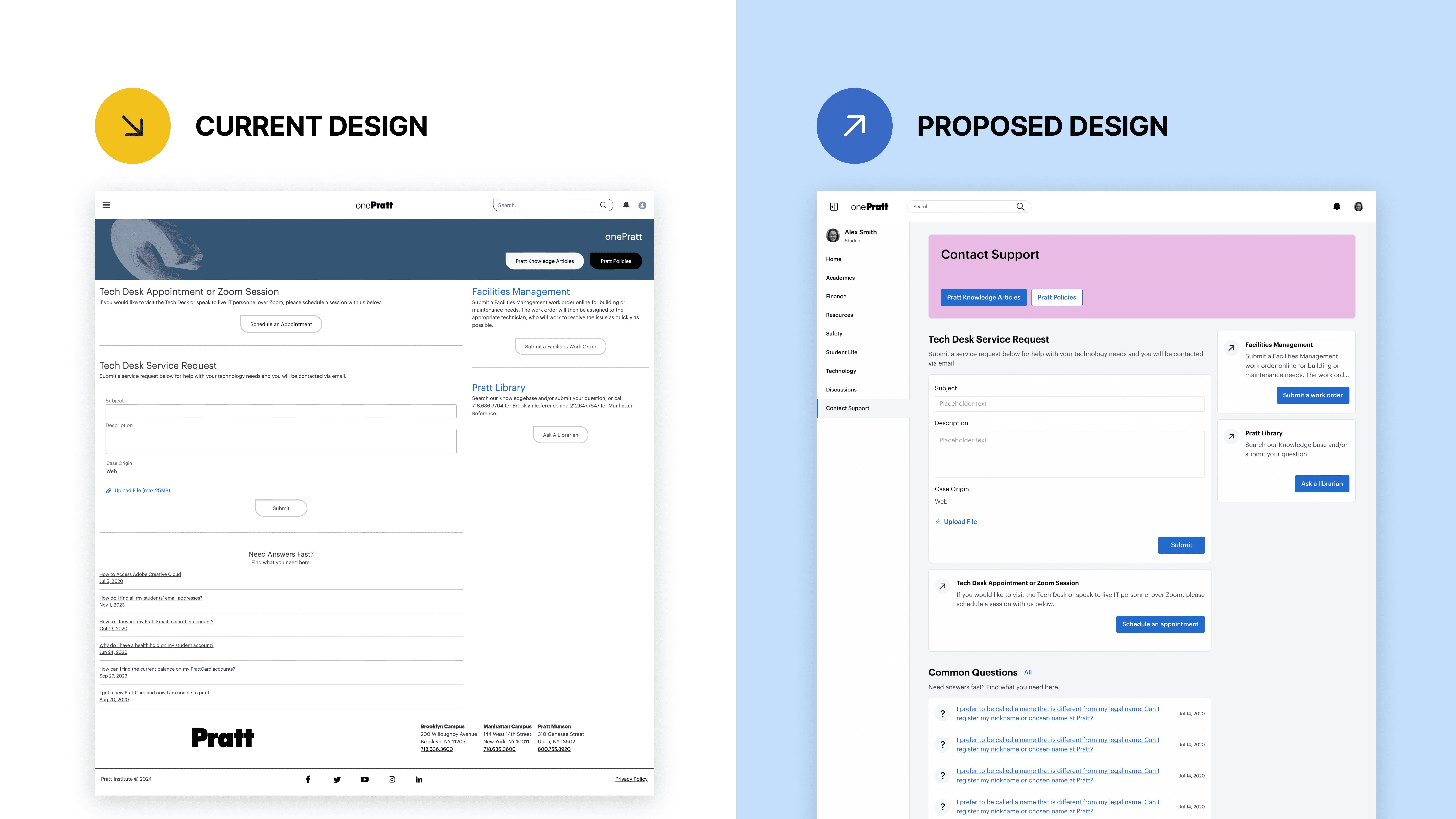
Redesigning Pages that Shape the onePratt Platform
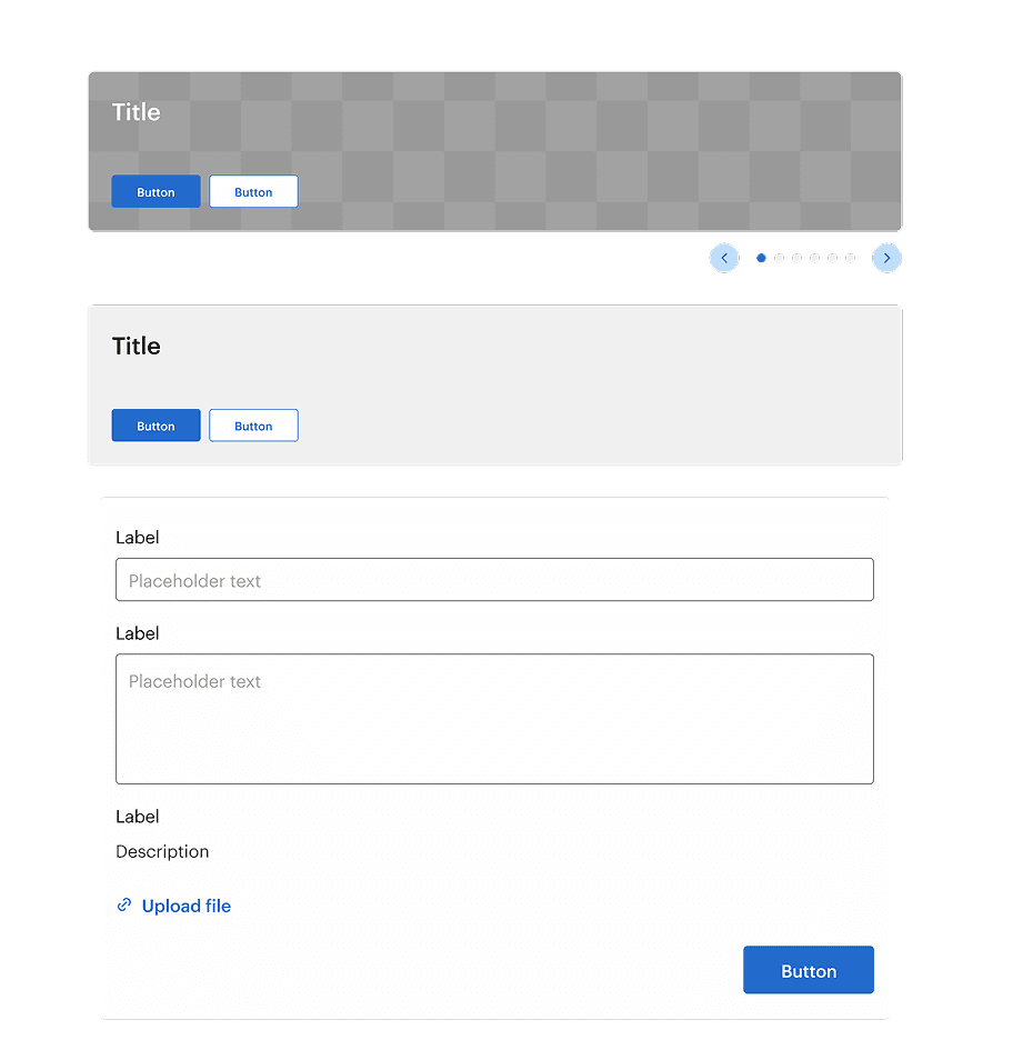
To create the most impact within a limited timeline, our team narrowed our scope to redesign the onePratt homepage and contact support page. These two pages contain high-traffic, high-utility features and house core components that are reused across the broader platform. By redesigning these foundational pages, we could make sure our new design system would scale effectively and set a consistent standard for the rest of onePratt.

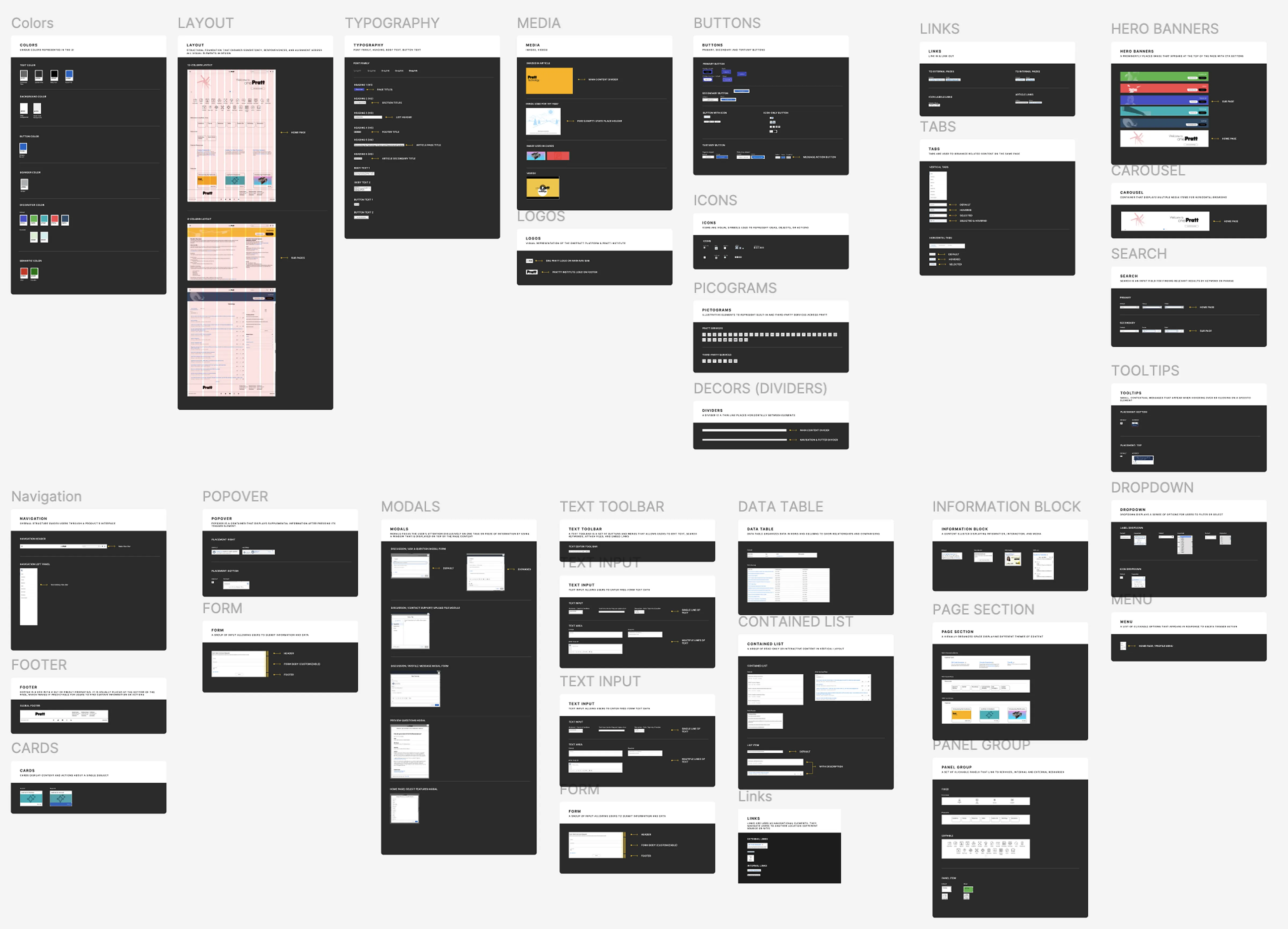
building the DESIGN SYSTEMS
Setting the Right Foundation: Tokens
Our team adopted the brand → alias → mapped token naming paradigm in Figma to create a scalable, consistent system that bridges design and development. This framework ensures future theming flexibility and avoids ambiguity across teams.
Laying a Strong Foundation: Color, Typography, Spacing & Layout
We chose primary blue to convey trust and efficiency, reflecting the platform’s role as a hub for student tools. We used Pratt’s yellow accent color to preserve brand consistency. In addition, we introduce decorative hues reflected each page’s feature.
We used Graphik in various weights and sizes to align with Pratt’s branding. We established clear font styles for display titles, body text, and button labels to enhance readability.
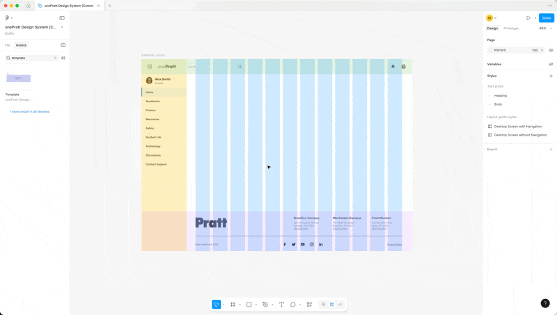
For spacing and sizing, we adopted an 8px base unit, creating a flexible scale for consistent padding, margins, and component sizing. The grid system features a 12-column layout optimized for a 1440px desktop screen, with clear areas for top, side navigation, content, and footer.
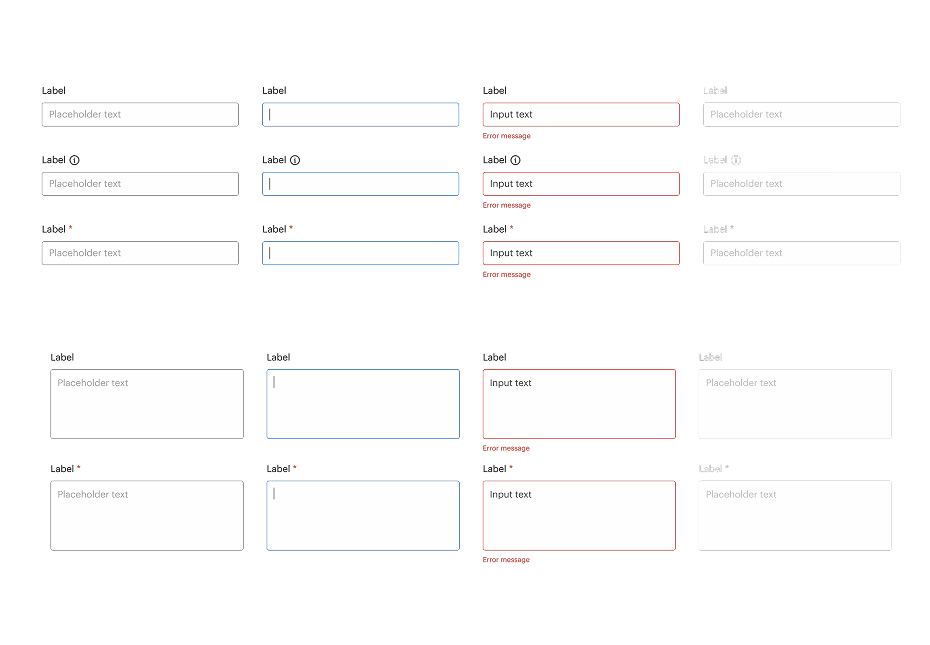
Accessibility was prioritized throughout: all color choices meet WCAG 2.2 contrast standards, and typography and layout were tested for legibility and clarity.

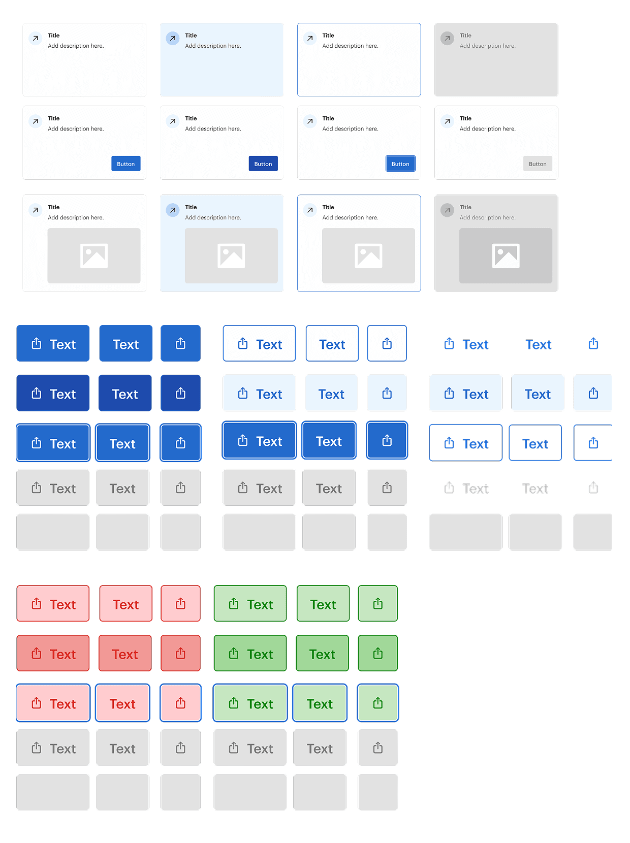
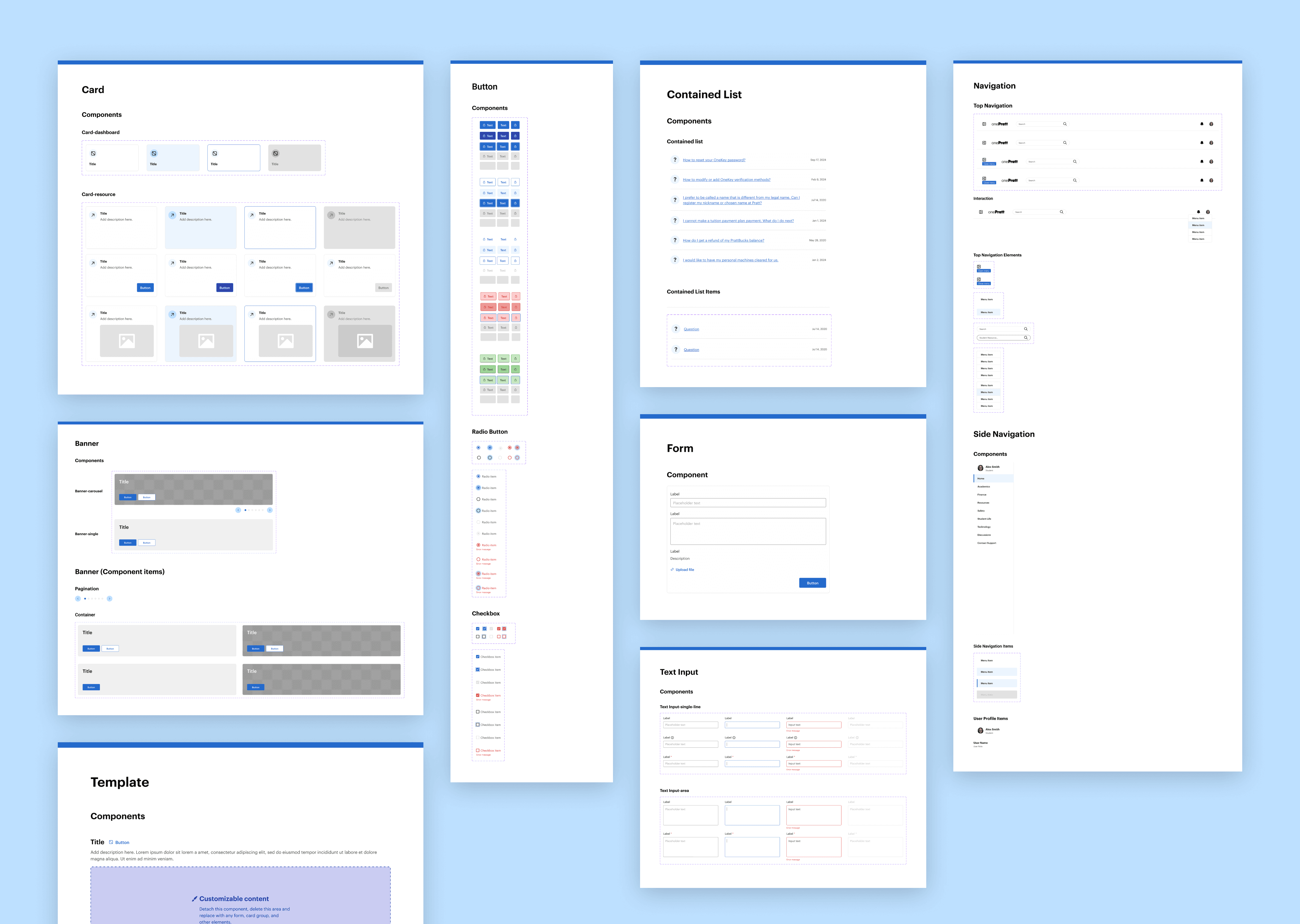
Creating the Core Components
We introduced standardized card components as modular entry points that link to both internal and external resources. This consistent visual pattern improves content discoverability and helps users scan and navigate the platform more efficiently.
To reinforce visual clarity and usability, we also unified the styling of buttons and contained lists across the interface. This reduces cognitive load and ensures users can easily recognize interactive elements.
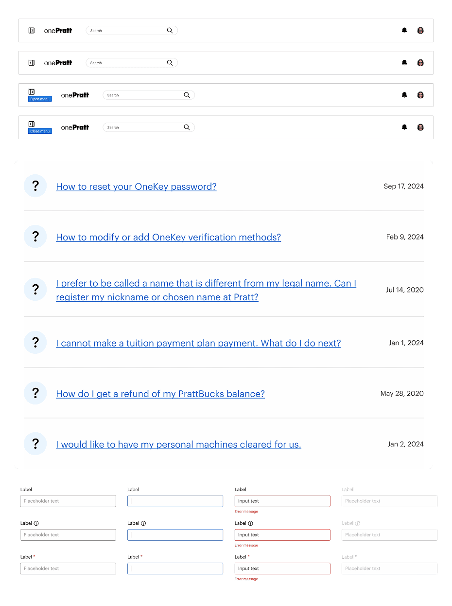
For navigation, we replaced the current hamburger menu with a full-screen dark overlay with a more efficient collapsible side navigation. This persistent, yet collapsible, menu allows users to easily access key pages without disrupting their workflow or context
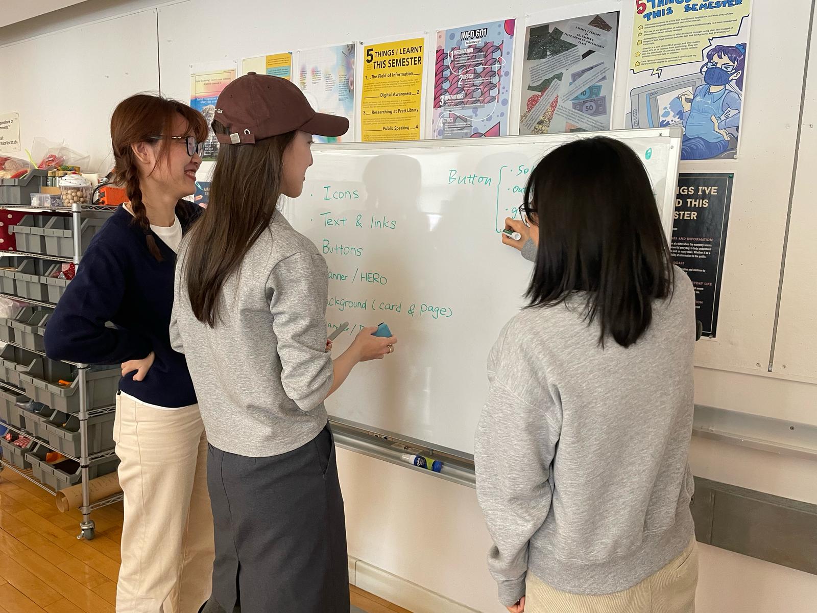
USER TESTING
Refining the UI Kit: Usability Testing with Designers
We tested the UI kit’s usability with 6 designers, identifying points of friction and adjusting foundation and components for clarity and flexibility.
100% of participants were able to complete the task to recreate the home page responded our design UI kit is easy to use.
66% of participants had trouble using the grids layout because of color opacity.
50% of participants were unfamiliar with component naming conventions — for example, “panel items” vs “cards”
FINAL DESIGN
Documenting for Clarity and Continuity
We used Zeroheight to create clear and comprehensive documentation. It includes foundation, component anatomy, usage guidelines, accessibility standards, and best practices. It also includes a resource section for design and accessibility. This ensures that both developers and future designers can onboard quickly, collaborate effectively, and maintain design consistency across the platform.

FINAL DESIGN
Token-Based System
No more pixel guessing — values are standardized and easy to implement.
FINAL DESIGN
Figma UI Kit
Intuitive components, flexible layouts, and easy updates.
REFLECTIONS
This was my first time creating a design system from the ground up, and it was an invaluable learning experience. I learnt how to create scalable tokens and components in Figma, and more importantly, I learned that a design system is more than simply a UI kit; it is also a communication tool that connects designers and developers.
It taught me that documentation and socializing are as important as design assets in ensuring acceptance and consistency.
If given more time, I’d like to do additional usability testing with designers to evaluate the system’s intuitiveness, as well as expand the UI kit to accommodate mobile interfaces for a more inclusive experience.
