
Redesigning SVA'S Library Online Collections Search Experience
ROLE
User Research & Design Consultant
TEAM
2 UX Consultants, SVA Library Team
Timeline
2025 - 12 Weeks
SKILLS
UX Research, Eye-tracking, User Testing, UI Design
Tools
Tobii Eye Tracker, Figma
CONTEXT
The School of Visual Arts (SVA) Library partnered with Pratt’s Institute DX Center UX team to improve the Online Collections & Databases webpage and help students better locate academic resources. With a growing number of students accessing digital resources, the School of Visual Arts (SVA) library aimed to improve the website’s usability across desktop and mobile devices.
CHALLENGE
Our team was tasked to uncover user pain points and provide actionable design recommendations that would make the site more intuitive, engaging, and self-serve within the constraints of the Springshare content management & curation platform.
Solutions & impact
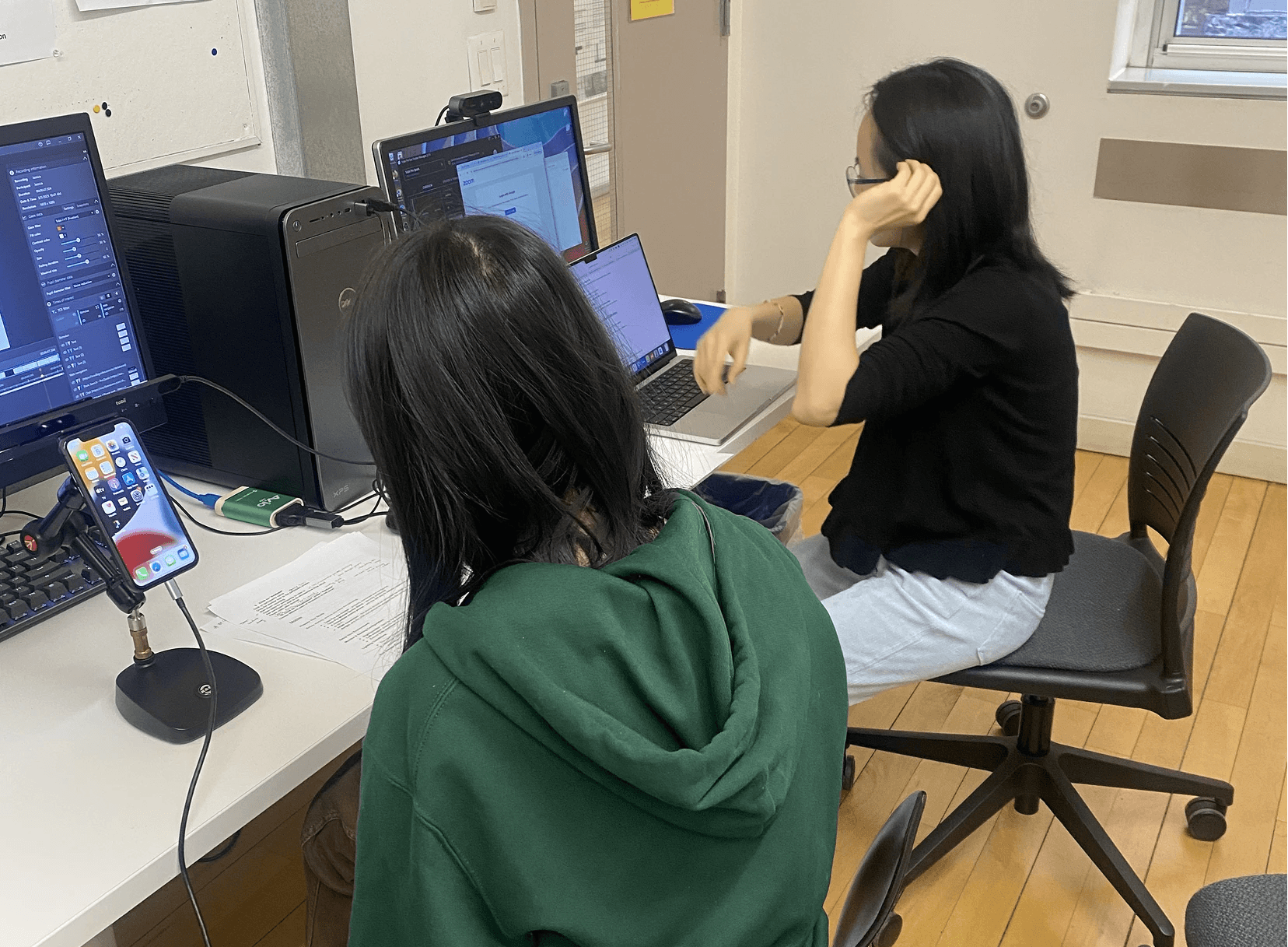
Our team conducted 12 eye-tracking sessions across desktop and mobile platforms to uncover visual navigation challenges, identify usability barriers, and evaluate overall engagement. Based on our findings, we provided 4 data-driven design recommendations aimed at making the site more self-serve, intuitive, and aligned with user expectations.
PROJECT TIMELINE
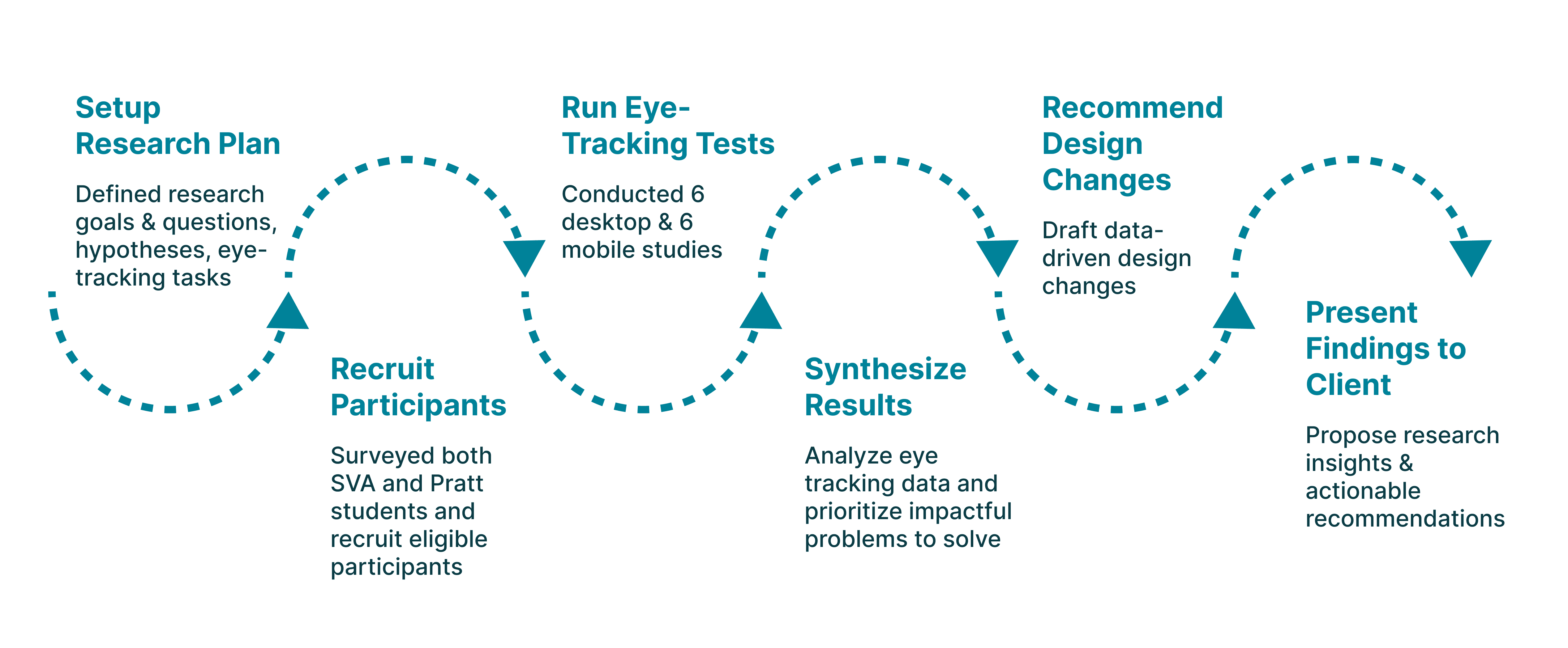
RESEARCH
Framing the Right Research Questions
We focused our research on how students find and interact with the SVA Online Collections website. Our guiding research questions were:
How do users locate the Online Collections database from the homepage?
Are users able to locate specific databases efficiently through the current SVA Online Collections visual layout?
How do users narrow down search results in the collections database?
How does the Online Collections Database information architecture affect users’ search efficiency?
Methodology
Data Collection & Analysis Tool
To align our study with our research questions, we designed a series of realistic tasks based on common student needs. After piloting a mock eye-tracking test, we refined the tasks for clarity and impact, focusing on key user actions such as discovering the entry point, using the search bar, filtering, finding subject guides, and locating help resources.
Key Research Insights
After conducting eye-tracking studies, we uncovered 17 usability issues based on 188 observation notes. We prioritized addressing the 4 most impactful issues on the user experience:
PAIN POINT 1
Participants don't understand what “Online Collections” means, making it difficult to find the entry point
Pain point 2
Participants misunderstand how to use the Online Collections database
60% of participants incorrectly used the search bar to look for specific articles or topics, not realizing it was meant to find databases, not individual resources.
Pain point 3
Filters are overlooked on mobile devices
When asked to find a specific type of database (e.g., art history databases with articles), 5 out of 6 users did not apply any filters, significantly lowering their efficiency and accuracy.
Pain point 4
Poor visual hierarchy causes users to miss key features
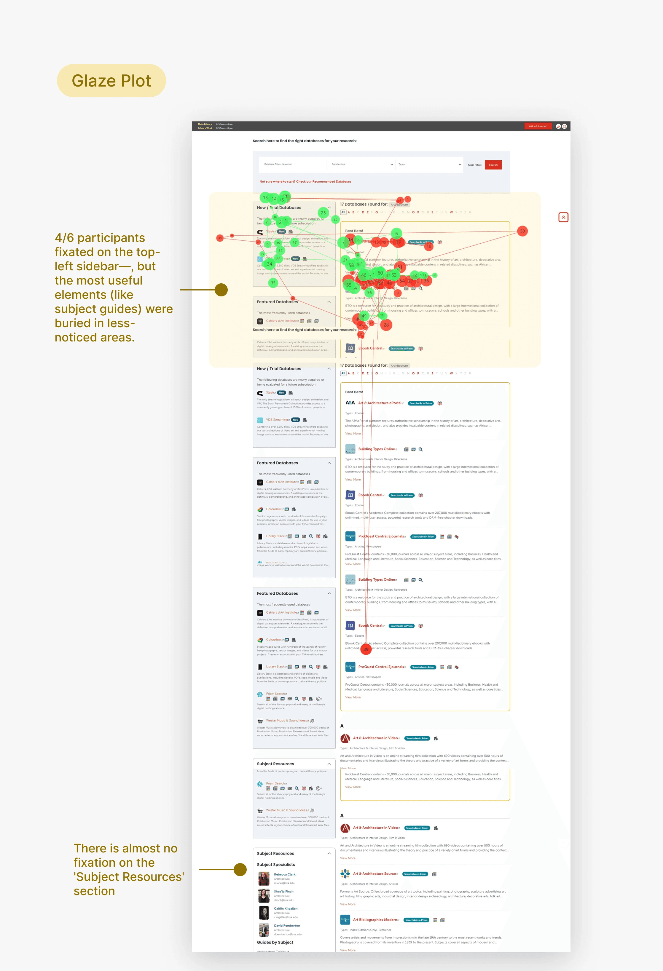
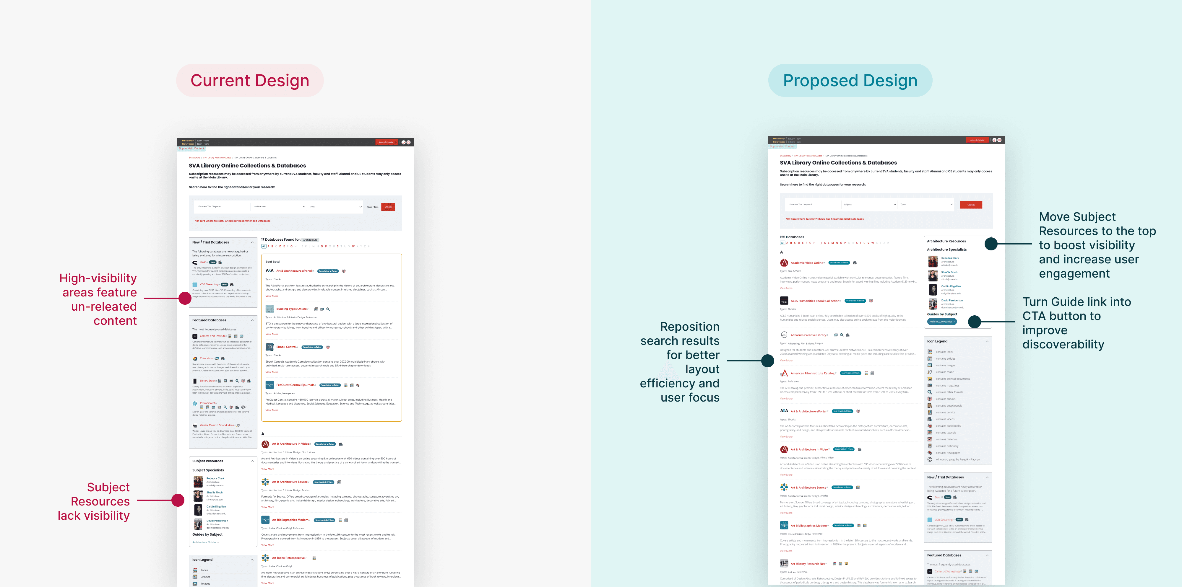
92% of participants found Subject Guides potentially helpful, but struggled to discover them due to their placement and visual presentation.
“The left column isn’t helpful — if it were relevant, it would’ve come up in my search.”
83% of participants think new & featured databases are irrelevant to their search results.
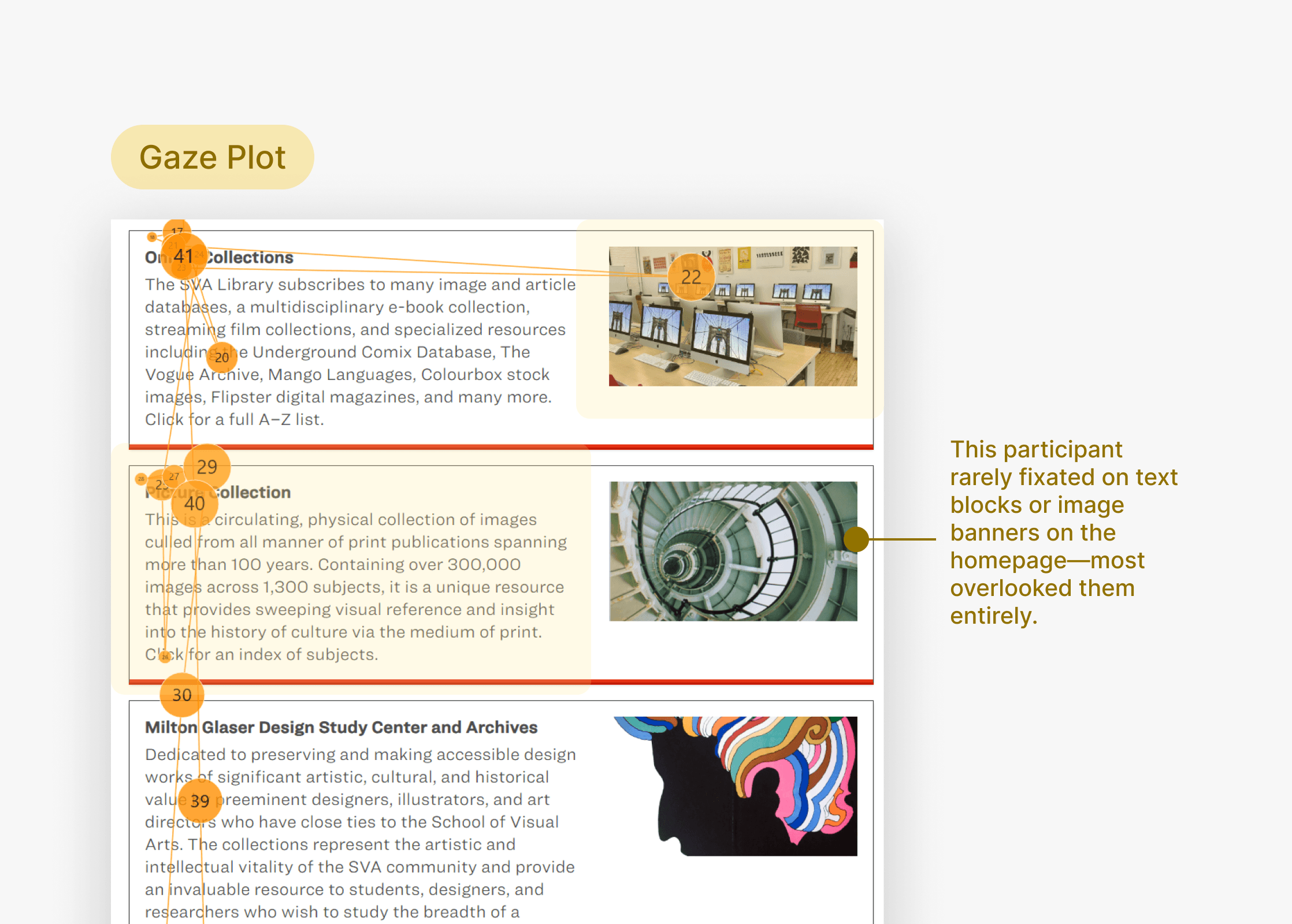
Participants fixated on less relevant areas (like the “New/Trial Databases” section) while completely missing high-value resources. This led to missed opportunities for support and increased search time.
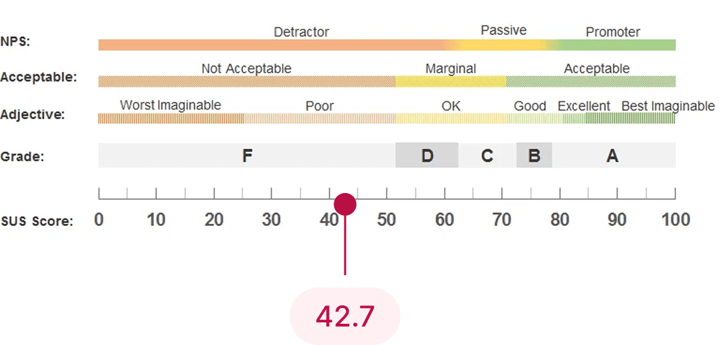
SUS SCORE
Low system usability scale score validates user pain points
The SUS score of 42.7 confirms what we observed during testing: users face multiple barriers when navigating the Online Collections site. Whether it’s unclear labels, poor visual hierarchy, or underutilized features like subject guides and filters, the low usability rating reflects real friction in the user experience.
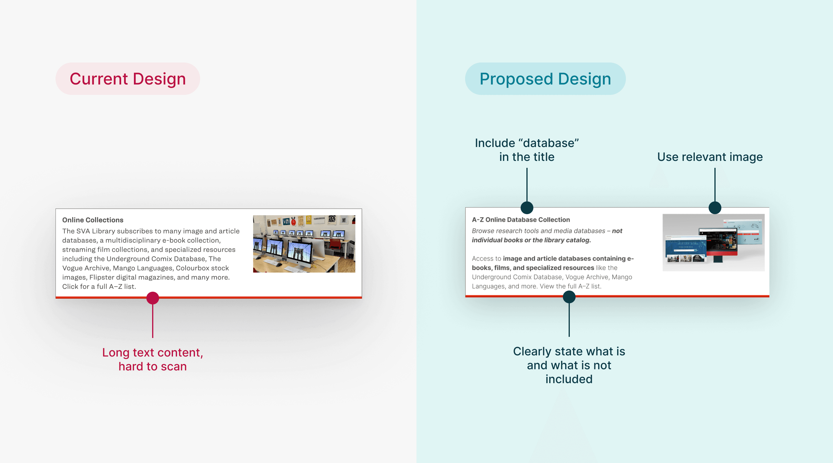
Design Recommendations
Clarify entry point with concise text and meaningful imagery
This helps students quickly understand what Online Database Collection offers and confidently begin their search without confusion.
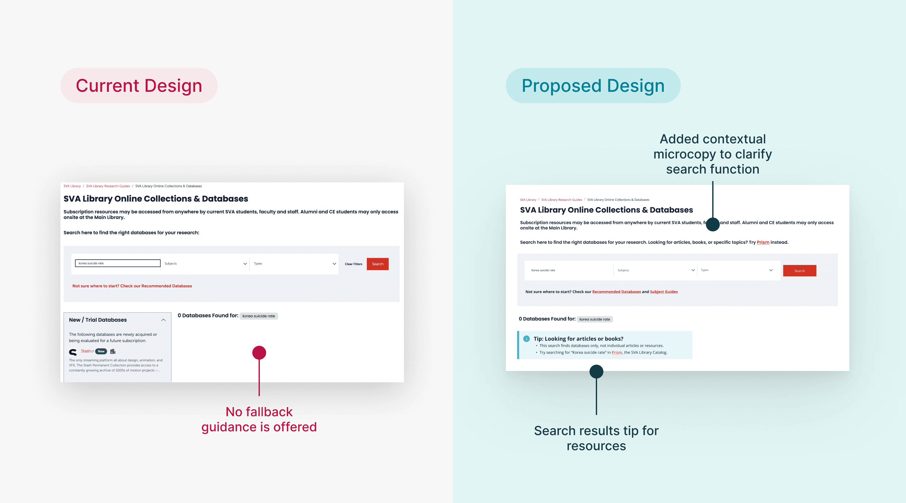
Design Recommendations
Clarify search function and improve search results feedback
A clearer search experience empowers students to find what they need faster, improving efficiency and reducing frustration.
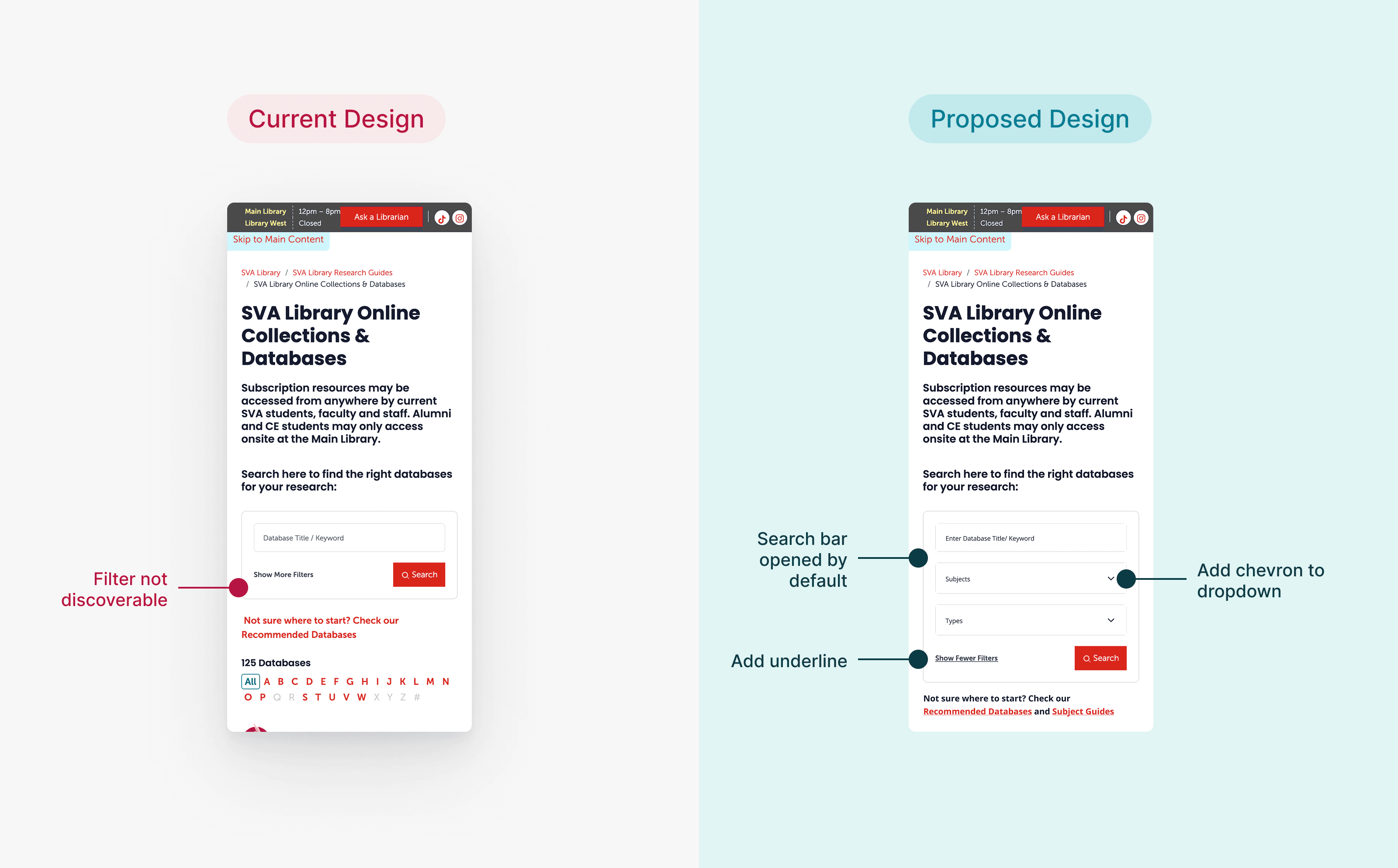
Design Recommendations
Make filters more visible and usable on mobile
Making filters more accessible encourages students to explore and refine results on their own, enhancing the site’s self-serve capability.
Design Recommendations
Improve subject guides visibility and icon clarity
These improvements make it easier for students to discover relevant resources independently, leading to deeper engagement with the content.
IMPACT
We presented our research findings and design recommendations to the client team at the SVA Library. Overall, the feedback was positive, with enthusiasm for the clarity, relevance, and feasibility of our suggestions.
“Excellent recommendations…you paid close attention to our system constraints, which is really appreciated.”
— Phoebe Stoneking, Digital Services Librarian
next steps
If the project were to continue, I’d love to gather more qualitative data through interviews or surveys to better understand how students experience the Online Collections. This would complement our eye-tracking data and provide deeper insights into user needs and pain points.
I’m also particularly interested in refining the design of the Subject Guides feature to better highlight its value and make it more accessible to SVA students.
Reflections
This was my first time conducting eye-tracking studies using Tobii, and it was both a fun and challenging experience. One key lesson I learned is that collecting data is just the beginning, the real value comes from turning those patterns into meaningful, actionable insights.
As an aspiring product designer, this experience helped me better understand how design and research work hand-in-hand. Our team ran into a challenge when we couldn’t generate a combined heatmap for all participants. But instead of getting stuck, we pivoted by using individual gaze data and other research data to validate our assumptions. This taught me a valuable lesson: in research, you won’t always have perfect data, but you can still find strong signals if you know how to work with what you have.